Create bar charts
d-bar-charts.Rmd#>
#> Attaching package: 'dplyr'
#> The following objects are masked from 'package:stats':
#>
#> filter, lag
#> The following objects are masked from 'package:base':
#>
#> intersect, setdiff, setequal, unionCreate a simple bar chart
#Prepare data
bar_df <- dta %>%
  filter(CAUSE == "ALL CAUSES" &
           REGIOJ == "Belgium" &
           MEASURE == "Deaths" &
           METRIC == "Rate" &
           AGEGRP %in% c("ALL") &
           SEX == "Both sexes")

#Get Sciensano color
col <- pal_sciensano()(1)

#Make plot
bars <- ggplot(bar_df, aes(x = YEAR, y = VAL_MEAN)) +
  geom_bar(stat="identity",
           position="identity",
           fill=col) +
  geom_hline(yintercept = 0, size = 1, colour="#333333") +
  sciensano_style() +
  labs(title="Deaths",
       subtitle = "Death in Belgium")
#> Warning in sciensano_style(): Please specify an available font
#> The first available font will be taken:
#> Using font: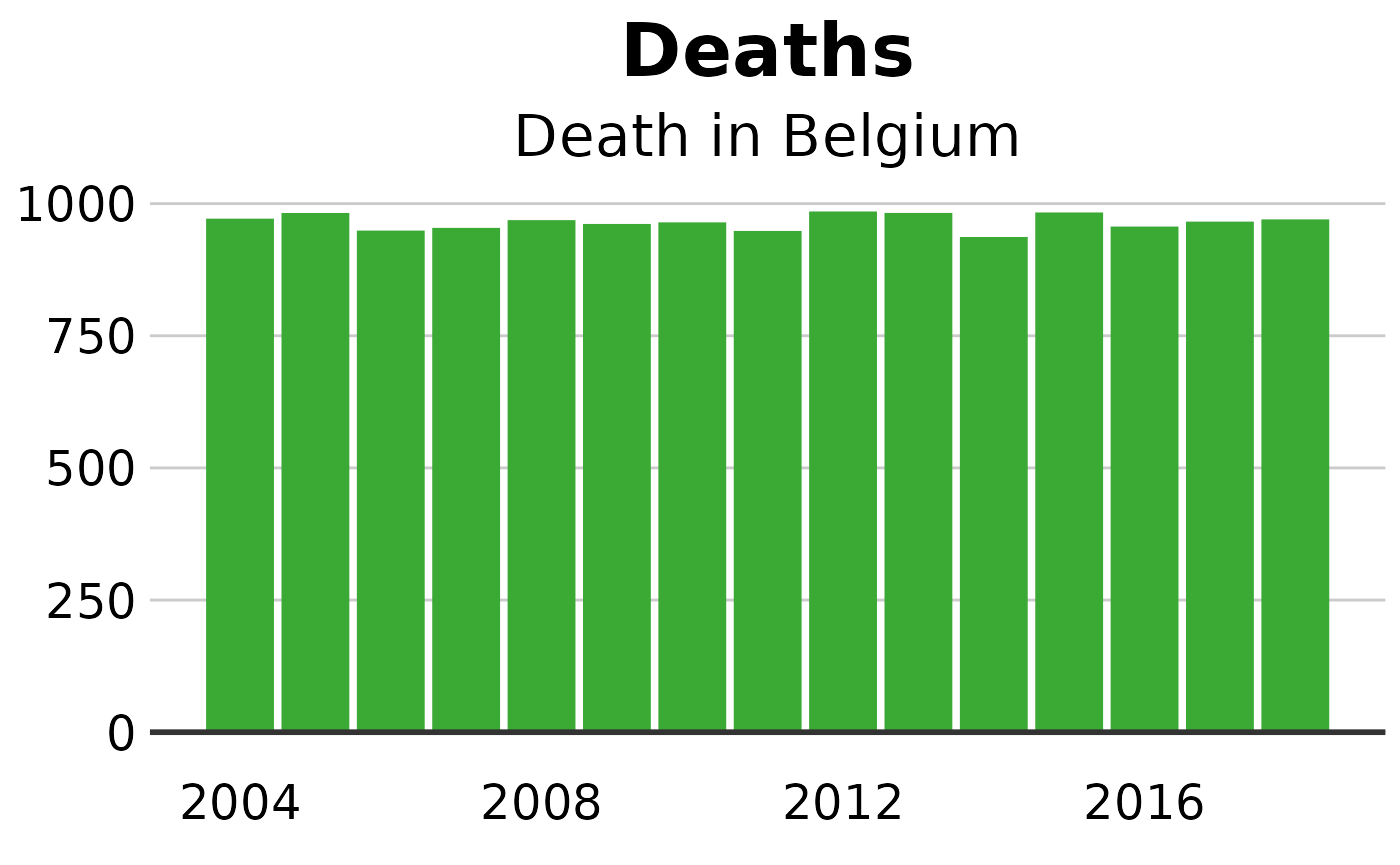
Make a stacked bar chart
#prepare data
stacked_df <- dta %>%
filter(CAUSE == "ALL CAUSES" &
REGIOJ != "Belgium" &
MEASURE == "Deaths" &
METRIC == "Number" &
YEAR == 2018 &
!(AGEGRP %in% c("ALL", "BSP", "ESP")) &
SEX == "Both sexes")
#Calculate percentages
stacked_df <- stacked_df %>%
group_by(REGIOJ) %>%
mutate(PERC = VAL_MEAN/sum(VAL_MEAN))
#create plot
stacked_bars <- ggplot(data = stacked_df,
aes(x = REGIOJ,
y = PERC,
fill = AGEGRP)) +
geom_bar(stat = "identity",
position = "fill") +
sciensano_style() +
scale_y_continuous(labels = scales::percent) +
scale_fill_sciensano() +
geom_hline(yintercept = 0, size = 1, colour = "#333333") +
labs(title = "Deaths across regions",
subtitle = "% of deaths by age category, 2018") +
theme(legend.position = "top",
legend.justification = "left")
#> Warning in sciensano_style(): Please specify an available font
#> The first available font will be taken:
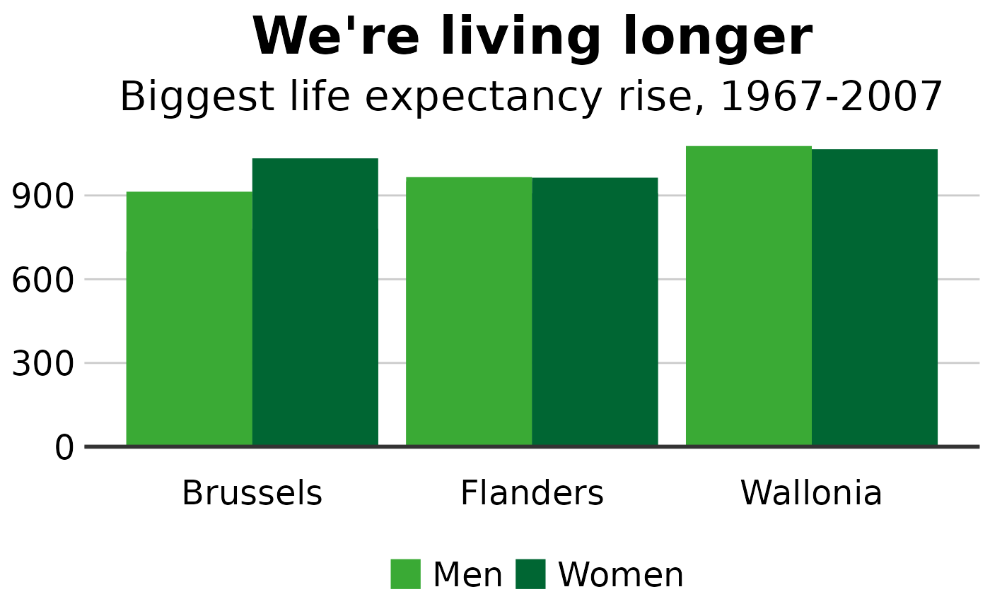
#> Using font:Make a grouped bar chart
Making a grouped bar chart is very similar to making a bar chart.
You just need to change position = "identity" to position = "dodge", and set the fill aesthetically instead:
#Prepare data
grouped_bar_df <- dta %>%
  filter(CAUSE == "ALL CAUSES" &
           REGIOJ != "Belgium" &
           MEASURE == "Deaths" &
           METRIC == "Rate" &
           YEAR %in% c(2004, 2018) &
           AGEGRP %in% c("ALL") &
           SEX != "Both sexes")

#Make plot
grouped_bars <- ggplot(grouped_bar_df,
                       aes(x = REGIOJ,
                           y = VAL_MEAN,
                           fill = SEX)) +
  geom_bar(stat="identity", position="dodge") +
  geom_hline(yintercept = 0, size = 1, colour="#333333") +
  sciensano_style() +
  scale_fill_sciensano() +
  labs(title="We're living longer",
       subtitle = "Biggest life expectancy rise, 1967-2007")
#> Warning in sciensano_style(): Please specify an available font
#> The first available font will be taken:
#> Using font: